Michele Melcher Illustration

Metal Gods: A Tribute to Judas Priest

Last year I was approached by rock illustrator, Mark Rudolph, to contribute to "Metal Gods: a Tribute to Judas Priest" coming out next month by Decibel Books. I've been a fan of Mark's work  for a while- he has done A LOT of cool stuff. Plus, I grew up listening to heavy music, Judas Priest included, due to being the youngest 3 loud music loving kids. The book is an collaboration choc a bloc full of illustrations from many talented artists and I can't wait to see it in person.

Here are my two contributions to the book. I got to draw the Metal God himself, Rob Halford. I was asked to do a portrait of him as well as one of the band during a the very spikey and leatheryperiod of their career. It was so much fun and I'm proud to be a part of it. You can pre order the book through Decibel Books here.

Rob Halford

Rob Halford

Hell Bent for Leather

Hell Bent for Leather

The Couch Crusher - Illustration for Men's Health Magazine

I recently had the opportunity to do this funny illustration for the April issue of Men's Health Magazine. Every month there is a column featuring exercises with how-to technical instructions accompanied by an illustration. This set of moves is called the "couch crusher" and you can do them while you are watching TV. Fear not if you have become one with your sofa while binge-watching Star Trek during the cold winter months - you can get ripped and never miss an episode! Just make sure that you don't freak out the dog break any furniture while your at it ;) 

Thanks to Robert and Pete for the Art Direction!

MHpage.jpg

Illustration of Dean Gary S. May for Georgia Tech Engineers magazine.

A few months back I was contacted by Georgia Institute of Technology to illustrate a portrait of Dean Gary S. May for the cover of the College of Engineering magazine. This portrait illustration will be featured on an upcoming issue of "Georgia Tech Engineers".  Although it is not yet published I do have permission to post the illustration.  It is such an honor to have been able to create such great work for one of the leading Universities in the world. Thank you to everyone at Georgia Tech who helped with your direction and feedback.

Dean Gary S. May in front of iconic Tech Tower at Georgia Institute of Technology.

Dean Gary S. May in front of iconic Tech Tower at Georgia Institute of Technology.

A Well Executed Print Campaign.

I try to send out email campaigns to existing and prospective clients twice a month (more or less depending on my schedule) and then follow up with a print campaign once or twice a quarter. I think it's really important to reach people with print because email can so easily go straight to the trash or spam folder and then quickly be forgotten. Many prospective clients are so busy that they don't want to receive emails at all. Getting a physical printed piece in the mail is different than getting an email, it gives an art director something to hang on to and if they really like it they might file it away and contact you for a future assignment. I usually get at least one or two jobs after I send out a printed piece so it is worth the time,money energy that I put into it.

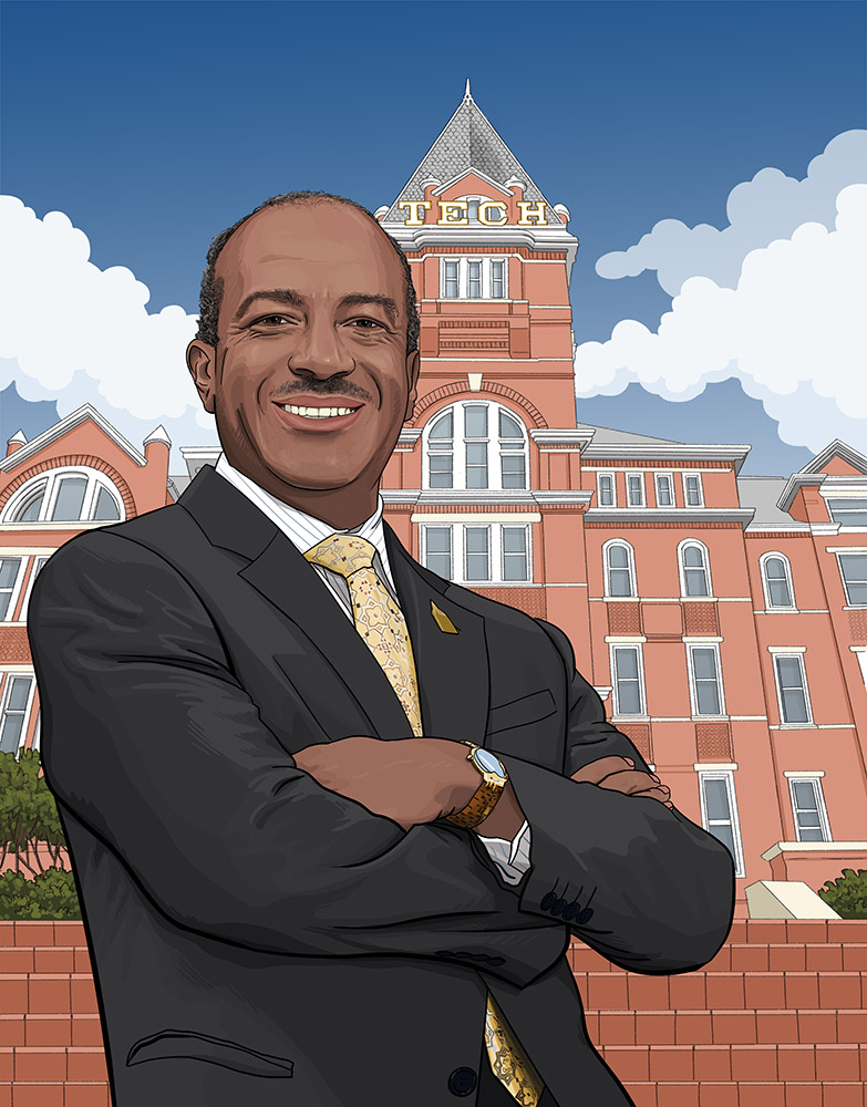
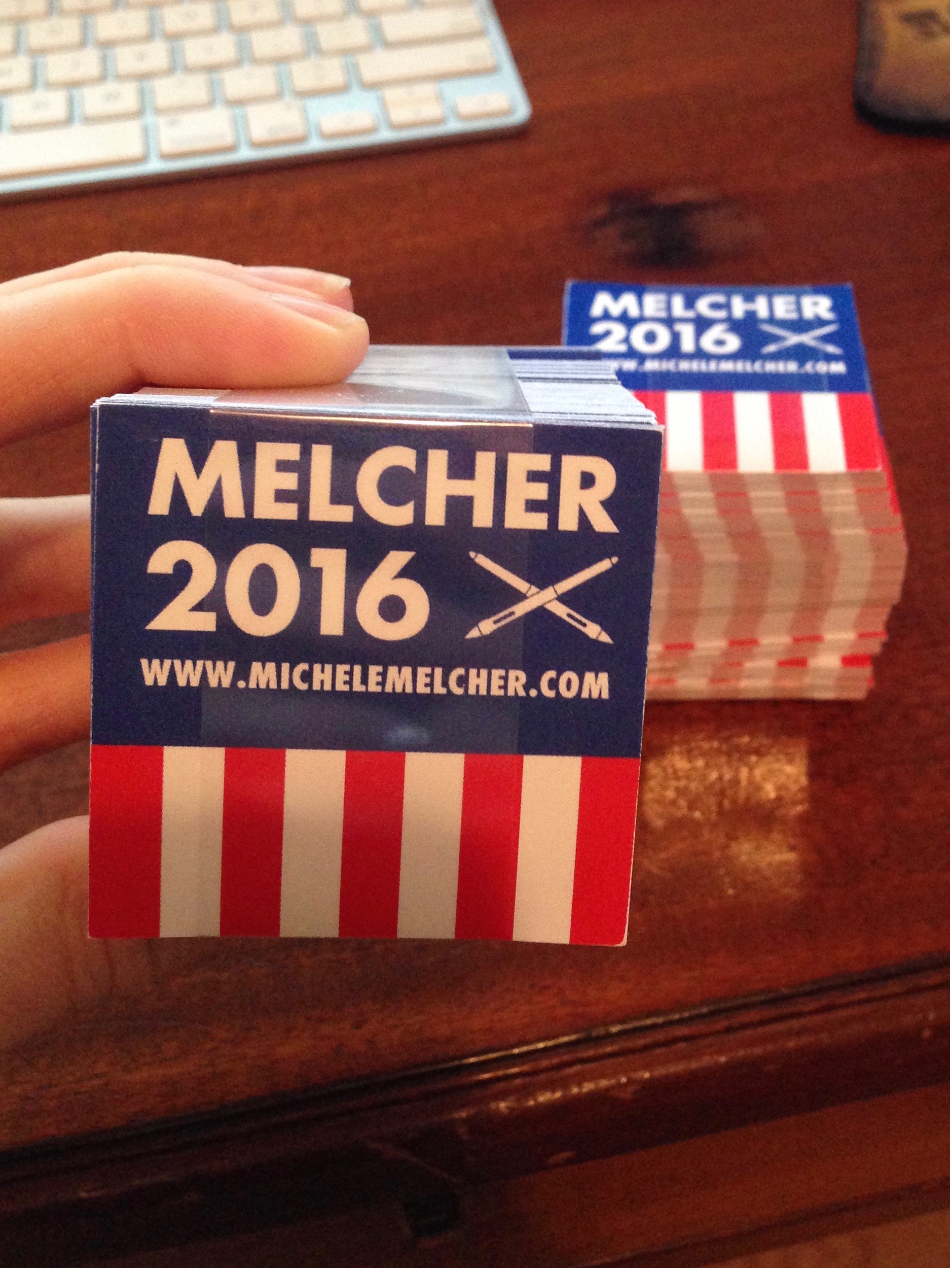
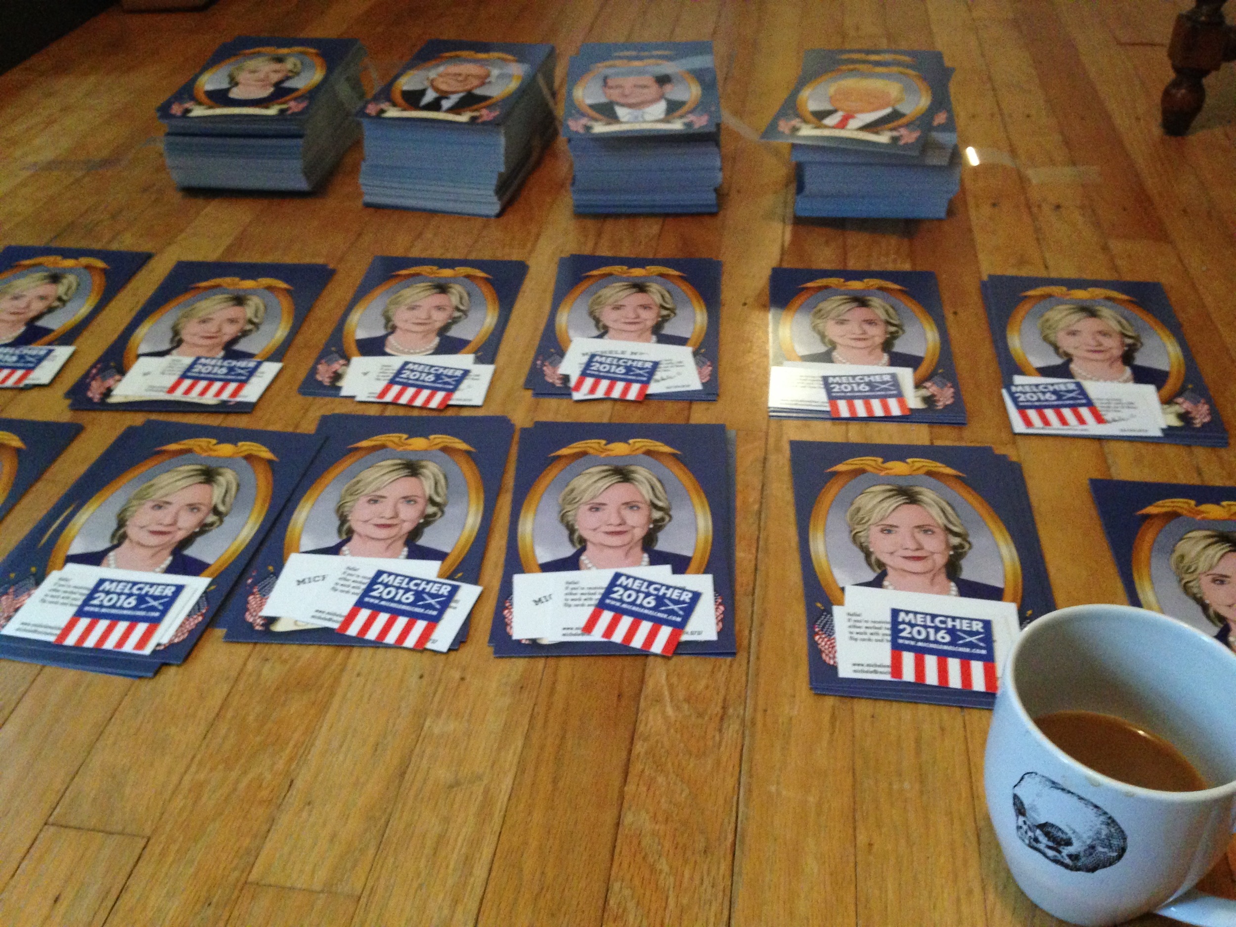
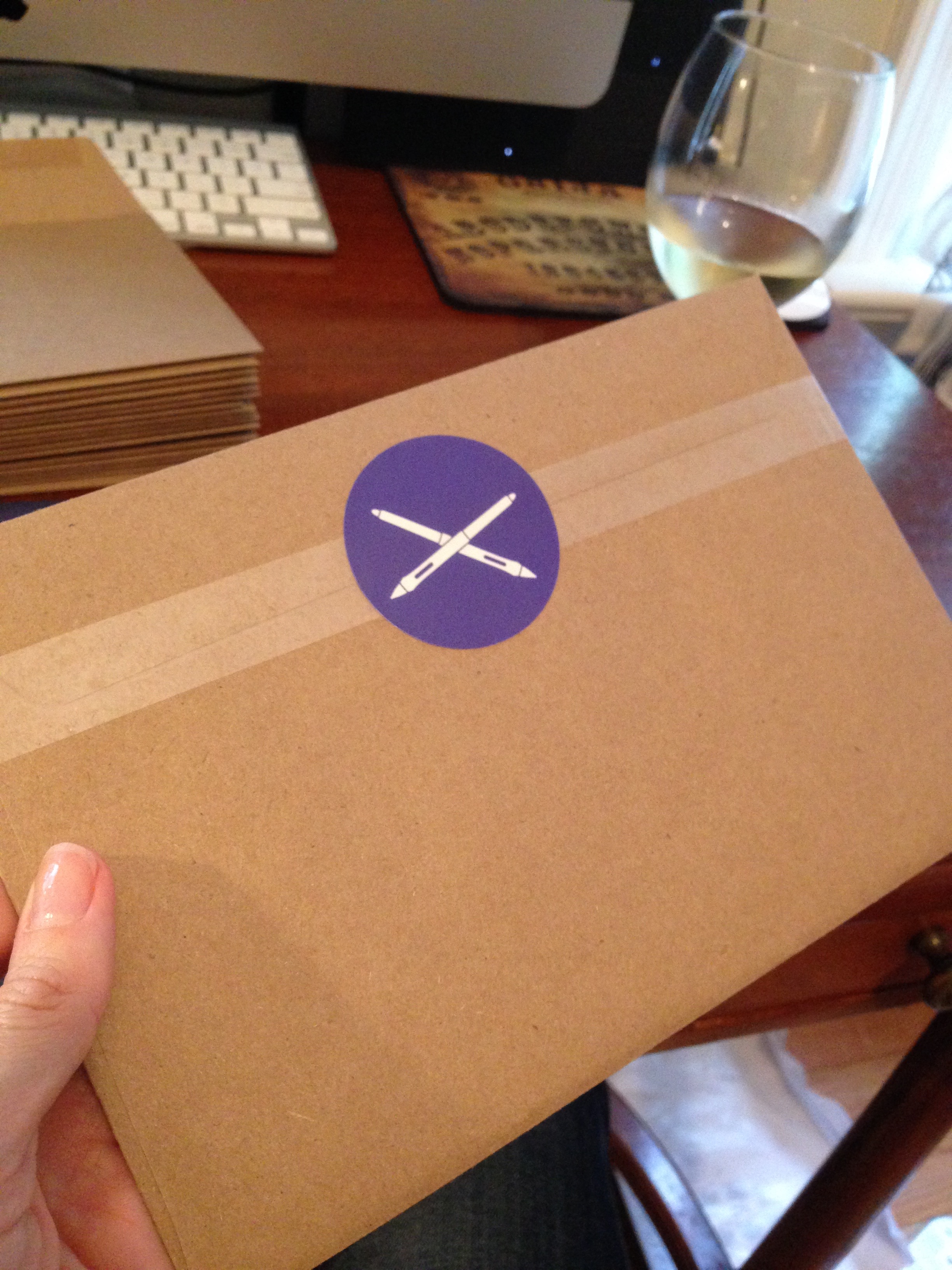
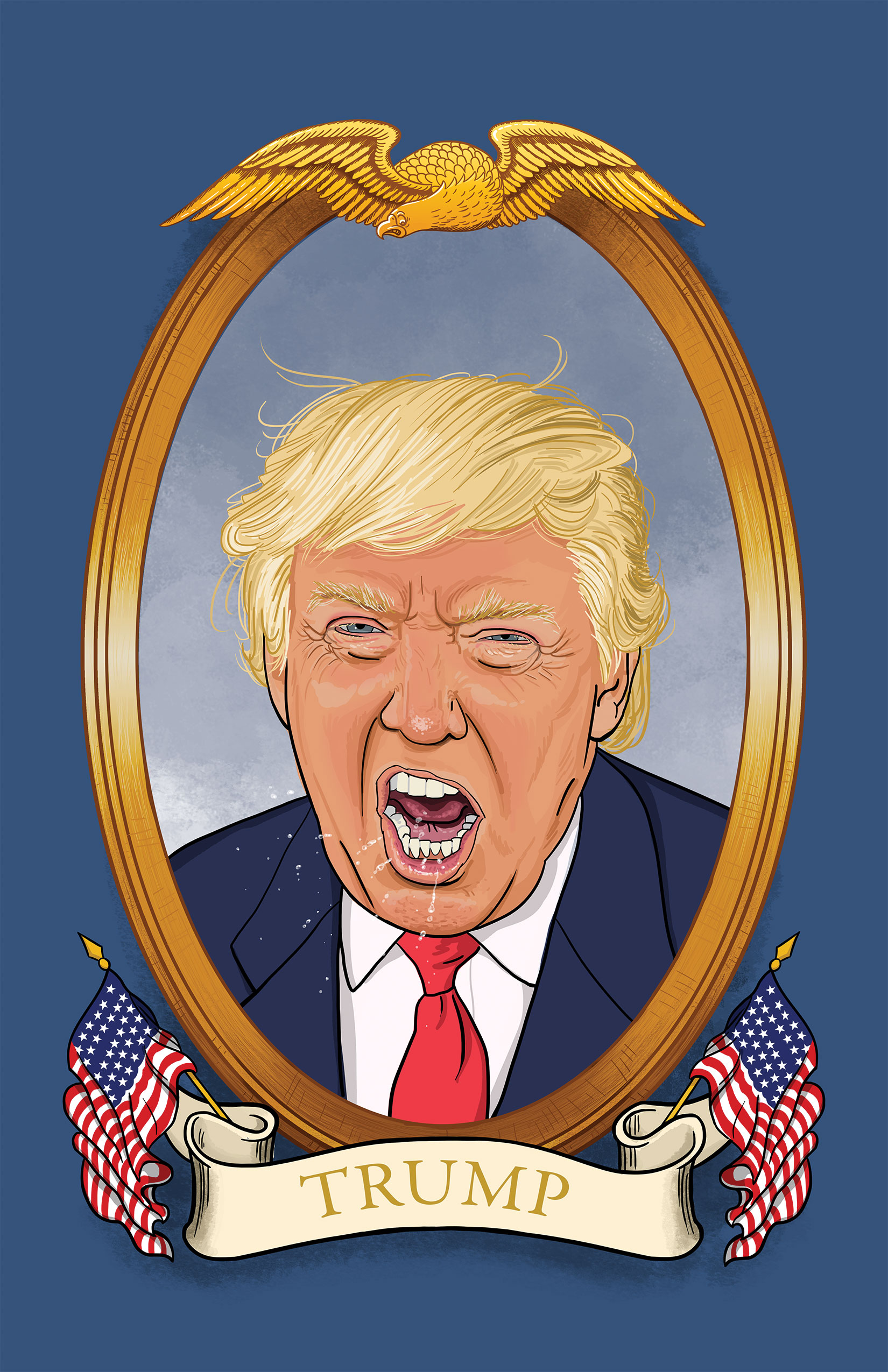
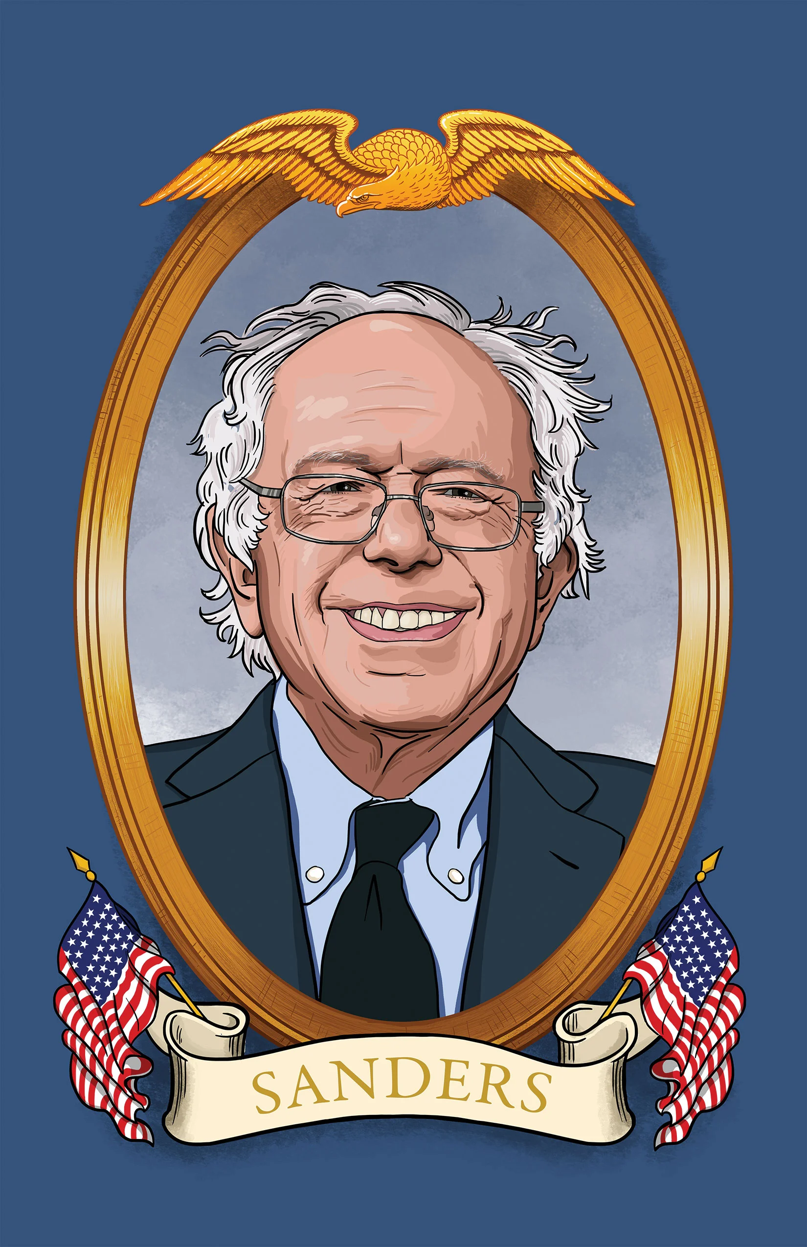
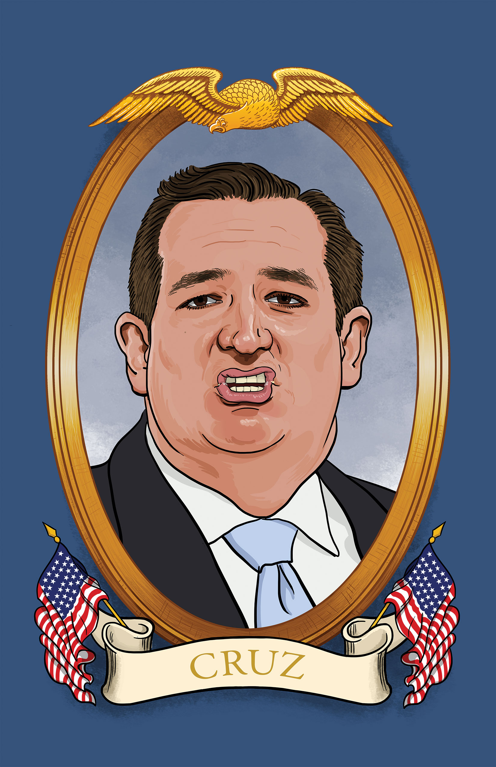
A few weeks back I put together an email and coinciding print campaign with my "Good Bad and Ugly" presidential portraits. I usually send out a postcard but this was a much larger and more expensive mailer. The mailer consisted of four over sized double-sided presidential postcards, a note, a business card and my very own "presidential" Melcher 2016 campaign sticker. All inside a brown grocery bag stock envelope with my crossed stylus logo sticker on the back.  It was a lot of work and money but I've gotten a great response from it so far. Several art directors even emailed me kudos - which was really nice. I know how freaking busy they are and taking the time out of their schedules to say that the cards brightened their days was totally worth it for me.

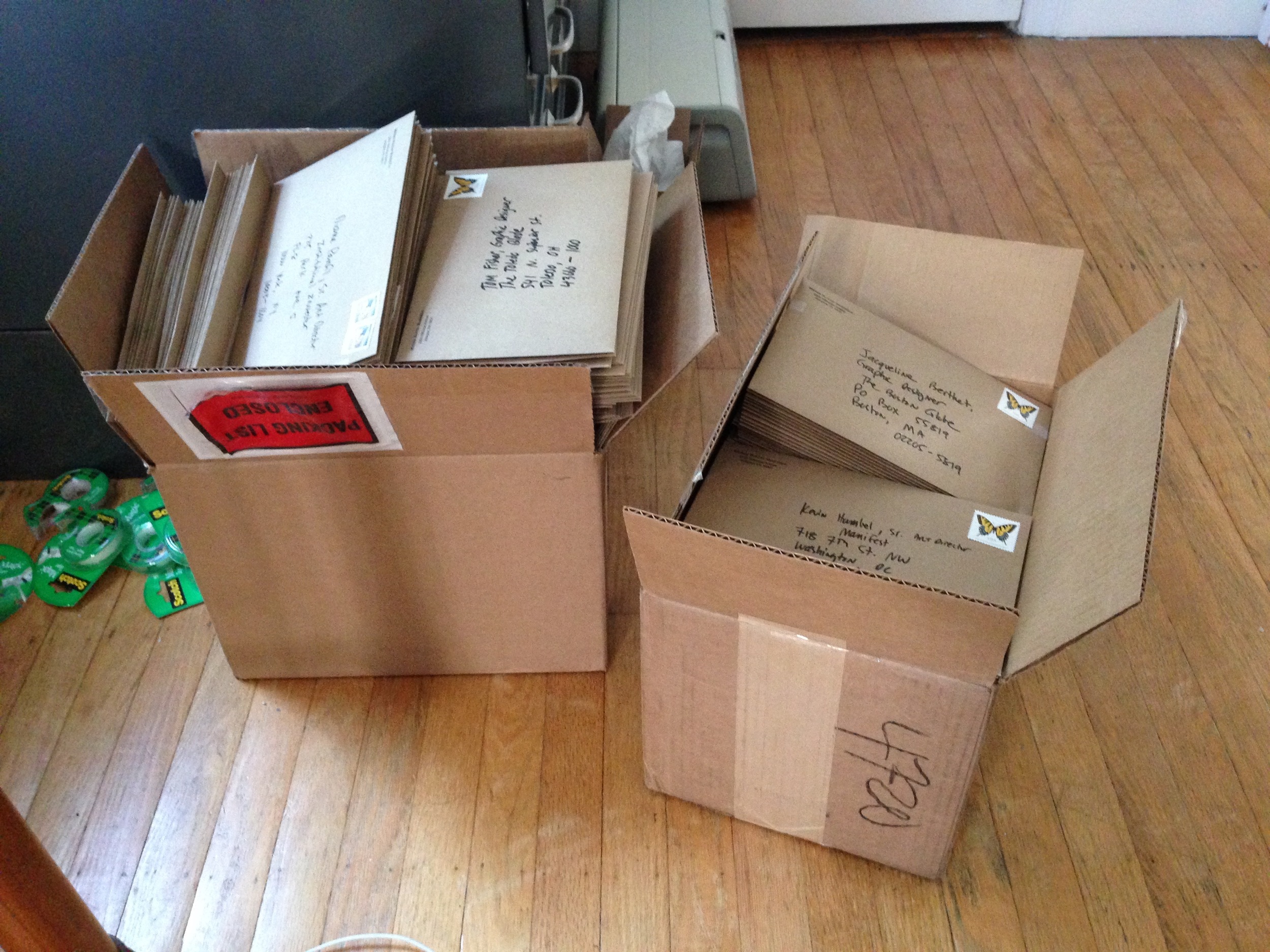
I created a small gallery of snapshots from the whole process. Click through it to see all of the photos and the GIGANTIC  (and heavy) boxes of envelopes at the end!

Enjoy!

The Good, The Bad and The Ugly 2016.

A few months back when I illustrated "Trump, Trump and Awaaaay!", I said that I wasn't going to talk about any more political stuff. I dislike political discussion mostly because it tends to bring out the inner ugliness in people that you don't normally see. That, and we still have to endure a whole friggin' summer and fall hearing about it everywhere, blah.

This is my pictorial answer to it all! Yep folks, no matter who is your favorite please remember that there are 2 sides to every story. *And I know that Ted Cruz dropped out of the race RIGHT AFTER I finished his portrait but it's still a good illustration (and quite funny with his mouth crusties) so I'm still posting it. I didn't even bother drawing John Kasich, because the poor fella never really had a chance with all of the attention that the orange fool gets. So without further adieu, scroll down to see the details of the good, the bad and the ugly!

Be careful what you wish for.

Be careful what you wish for.

Feelin' the heartburn.

Feelin' the heartburn.

I hope that you already ate your lunch. If you didn't , well then I'm sorry!

I hope that you already ate your lunch. If you didn't , well then I'm sorry!